 Back
BackShield Shot

We turned Shield Shot's ambiguous messaging into new branding backed by real research, from packaging copy to a full retail outreach plan.
Ana C.·Chloé N.·Shruva K.·Nick S.·Sophia L.·Christian K.
ShieldShot is a pre-alcohol wellness shot made out of organic and probiotic ingredients, meant to be taken before a night out. Our team spent the semester turning it from an early-stage product into something with tested messaging, a finished brand, and a real plan for getting into stores.
The founders already had a product and a tagline, "the shot before the shots," but they didn't have much sense of whether their language actually landed with the people they were trying to sell to, so we started there.
We ran two surveys, one on the category in general and one on ShieldShot's own copy specifically, and the results pointed in a useful direction: people were receptive to the product itself and cared about knowing what was in it, but some of the more clinical-sounding phrases on the label, "oxidative defense," "aids in alcohol metabolism," weren't actually registering the way the founders intended, even when respondents said the words sounded nice.
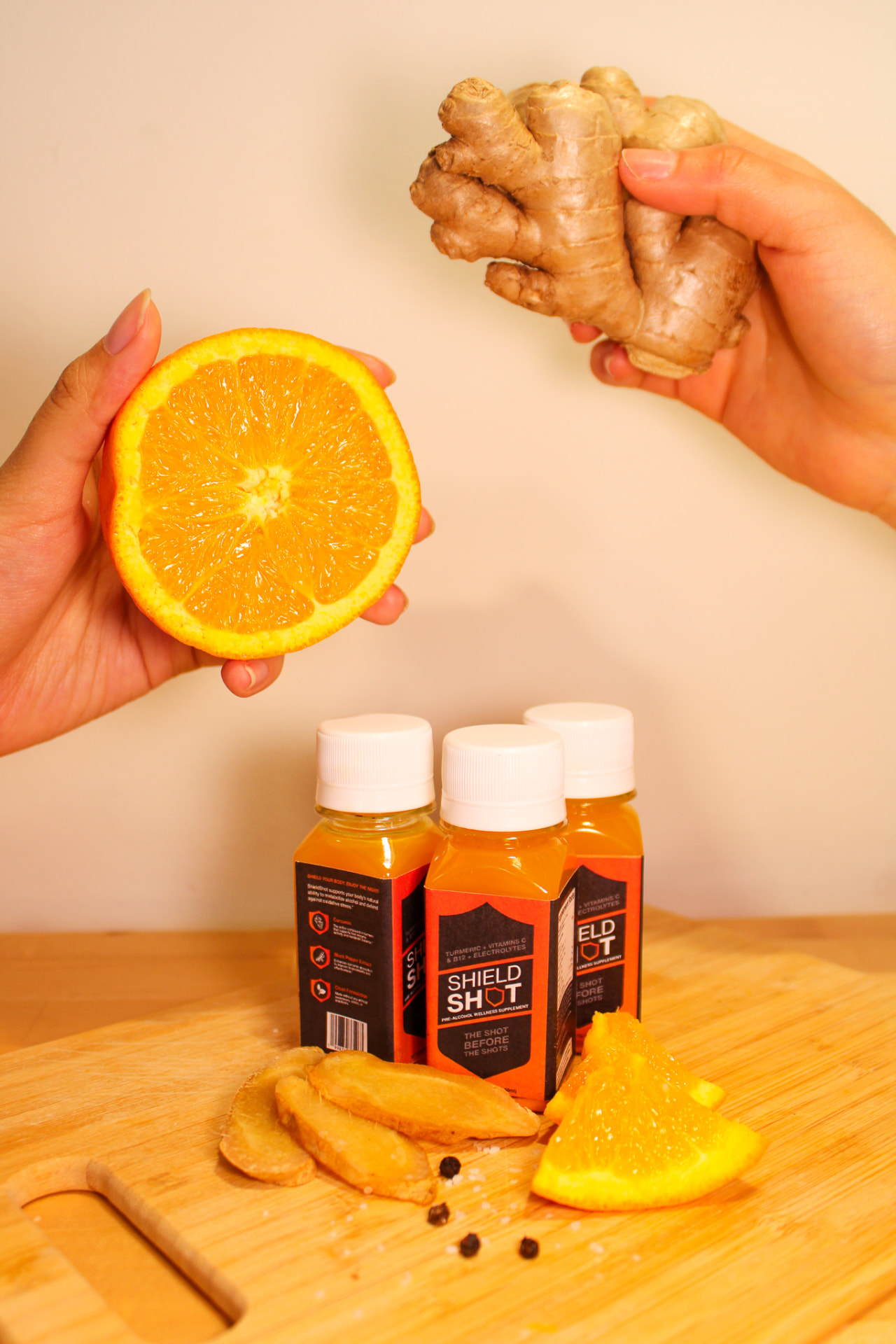
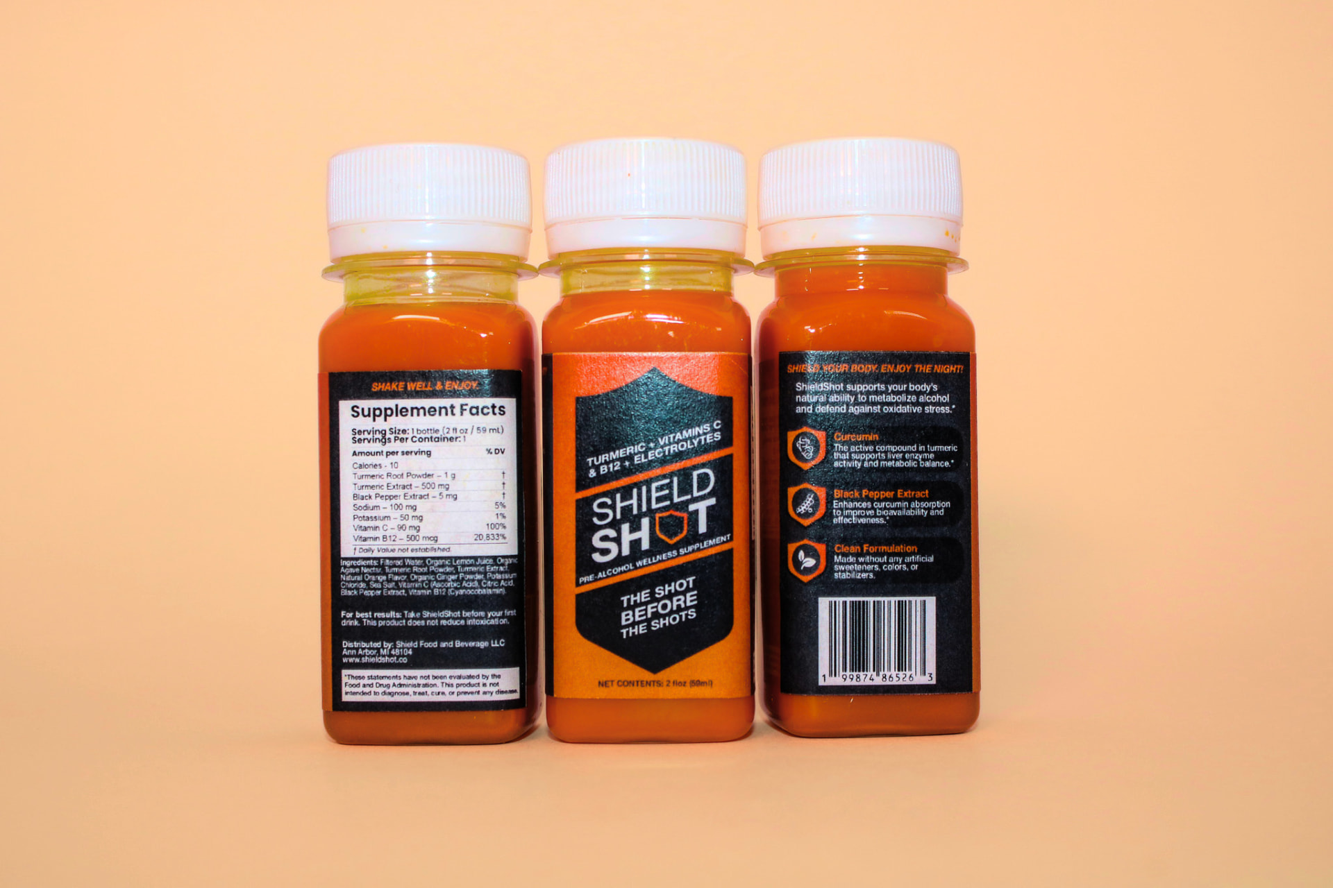
That gap between what sounded good and what people actually understood is what drove the packaging revision. We went through the label line by line and cut anything that read as impressive but vague, turning "the active compound in turmeric that supports liver enzyme activity" into the shorter "supports liver enzyme activity and metabolic balance," which is closer to how respondents had already described the benefit in their own words.
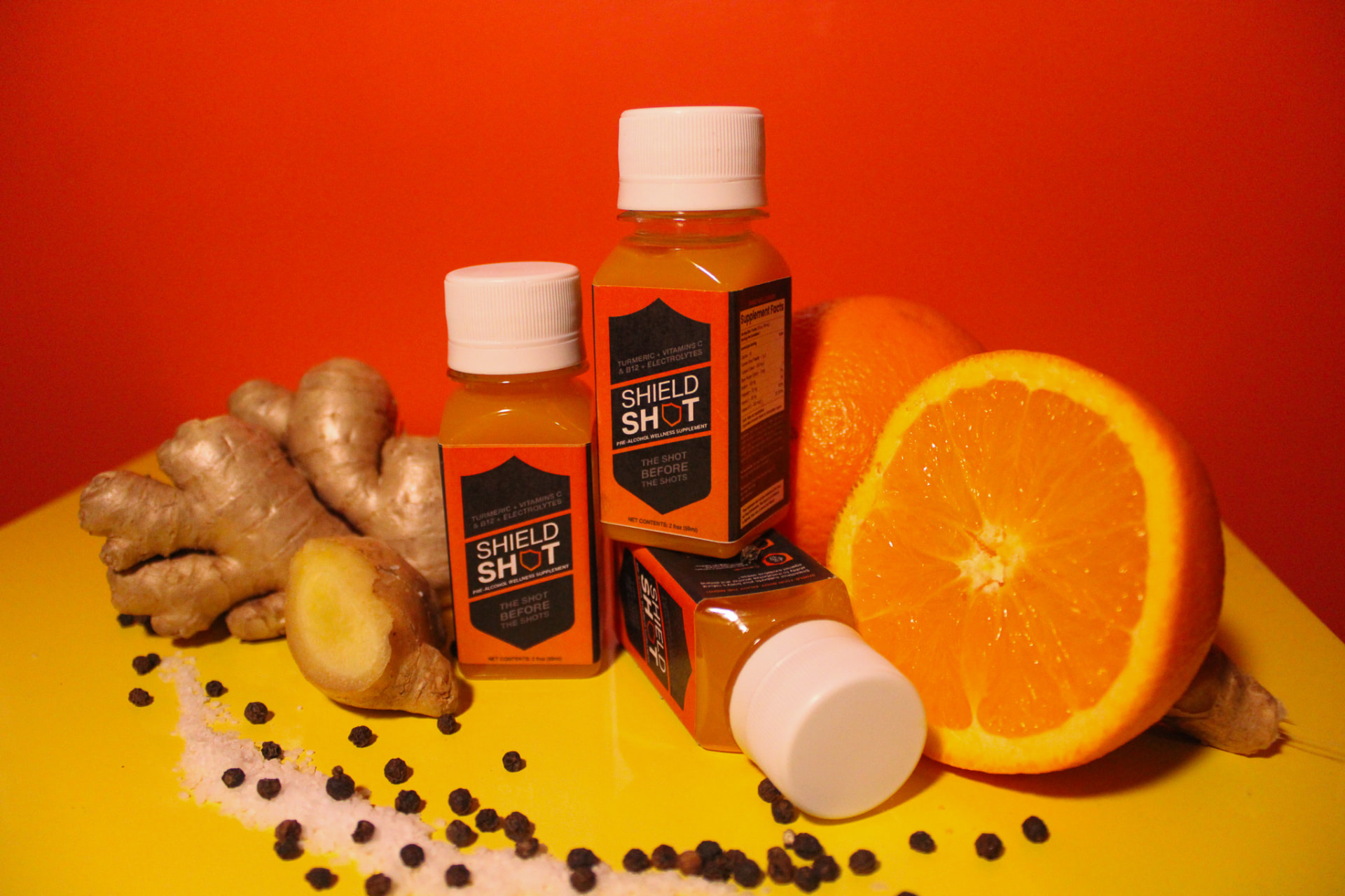
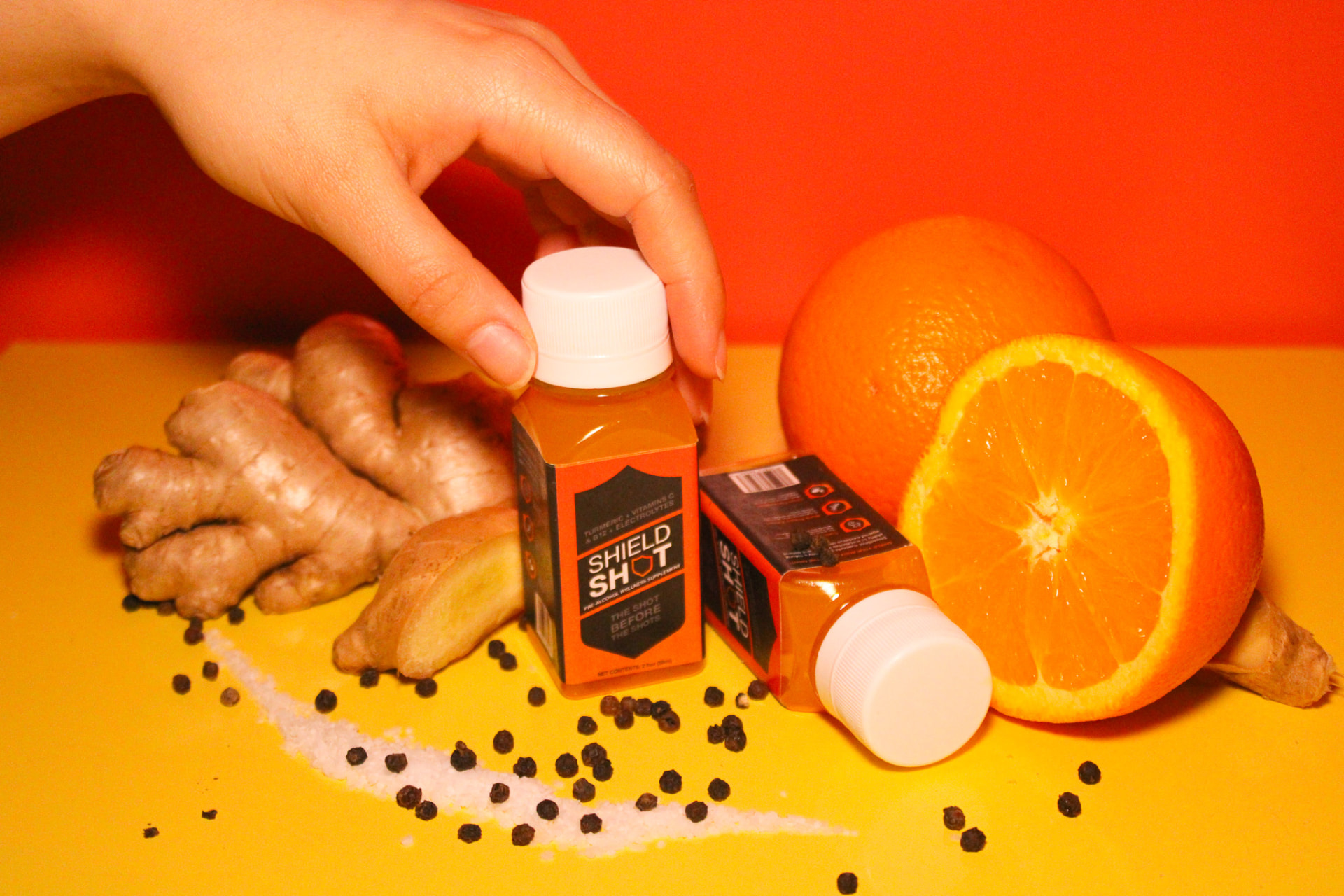
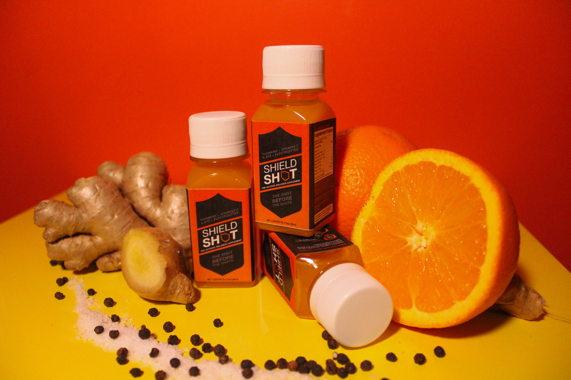
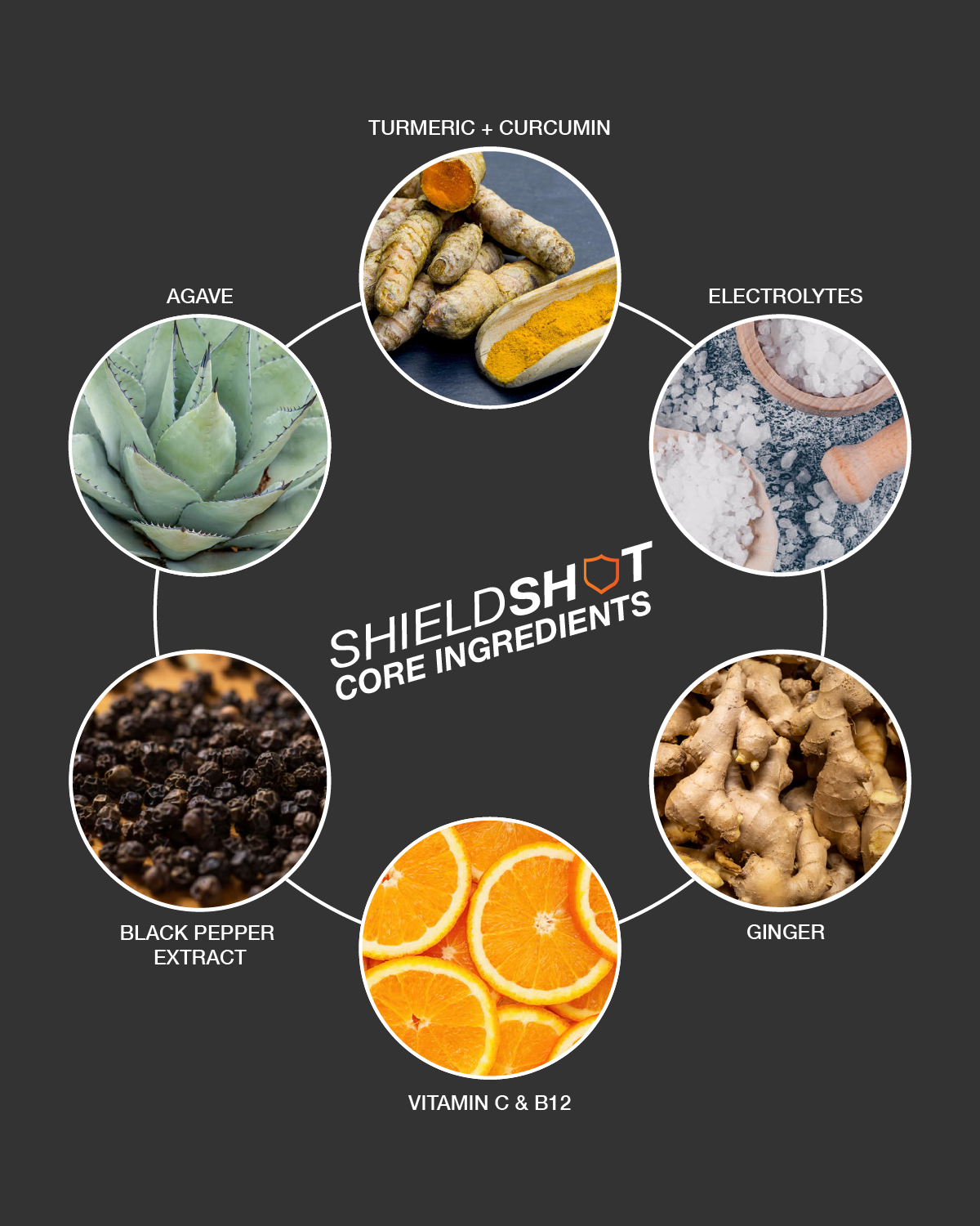
We also rebuilt the visual side of the brand from scratch, since the original moodboard leaned hard into party imagery, red cups, neon, bottles at 1am, and we felt it undersold what the product was actually for. We moved it toward something closer to a wellness drink, styled more like a tonic than a shot glass, with turmeric and citrus shot on a warm background, and that direction carried through a new brand book. This encompassed the logo, typography, and color palette, a new round of product photography, and an Instagram page that began with two flat product posts, evolved into a full set of ingredient graphics and benefit callouts.
On the retail side, we split outreach into three groups and researched each one on its own terms, since a wellness store, a bar, and a liquor store don't respond to the same pitch. That meant looking at local wellness stores, nightclubs, and liquor and party stores, each with its own customer base and its own peak days to plan around.
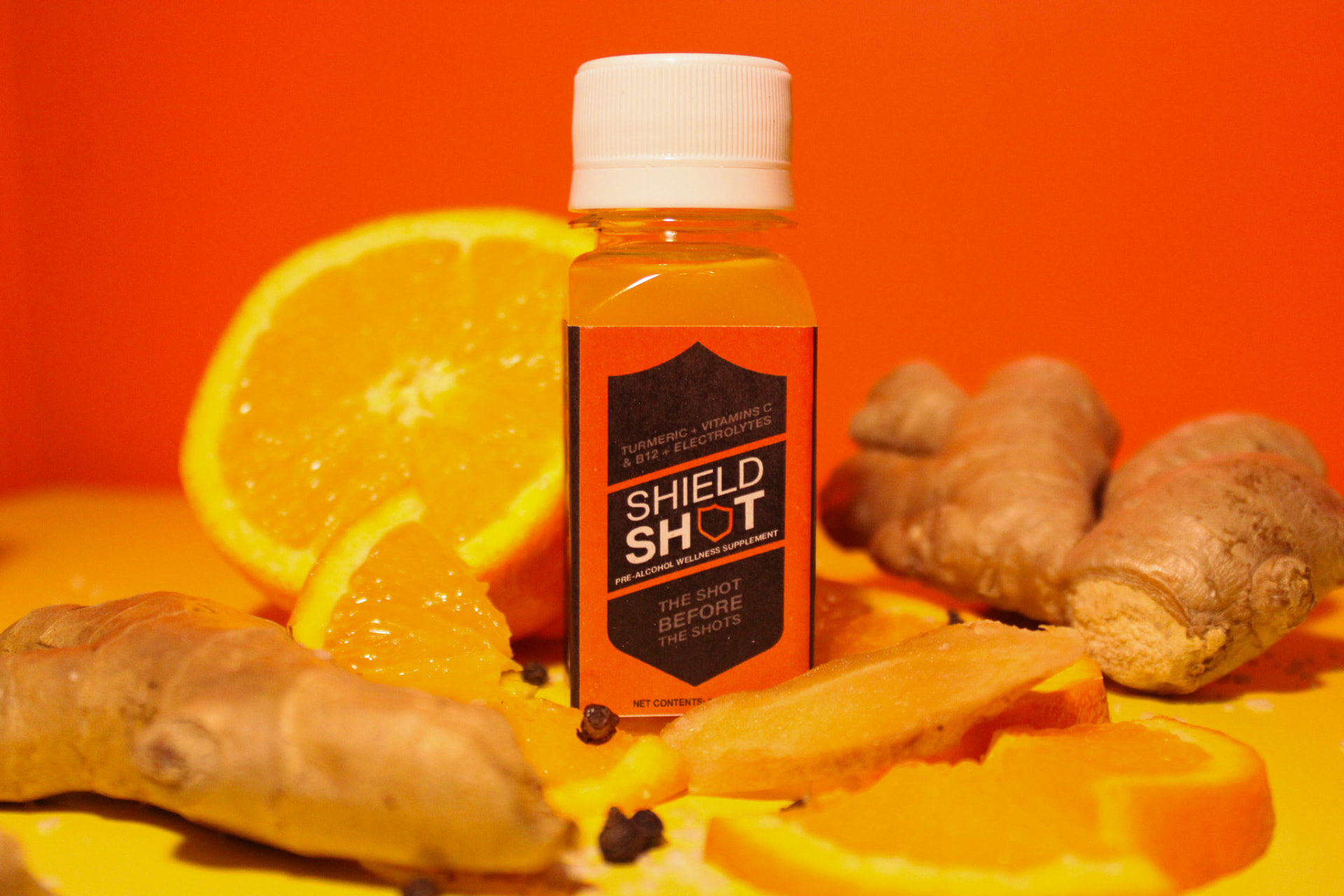
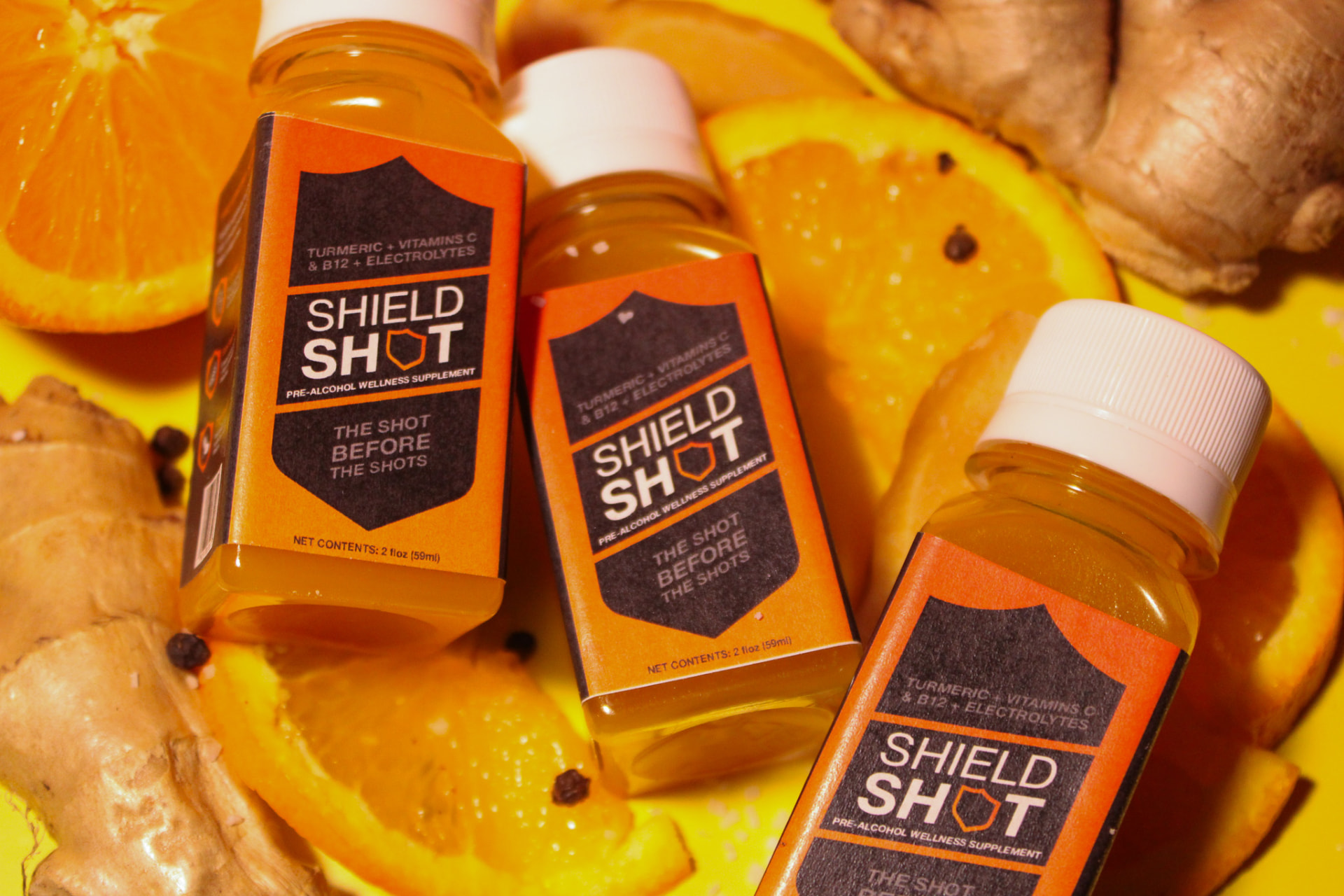
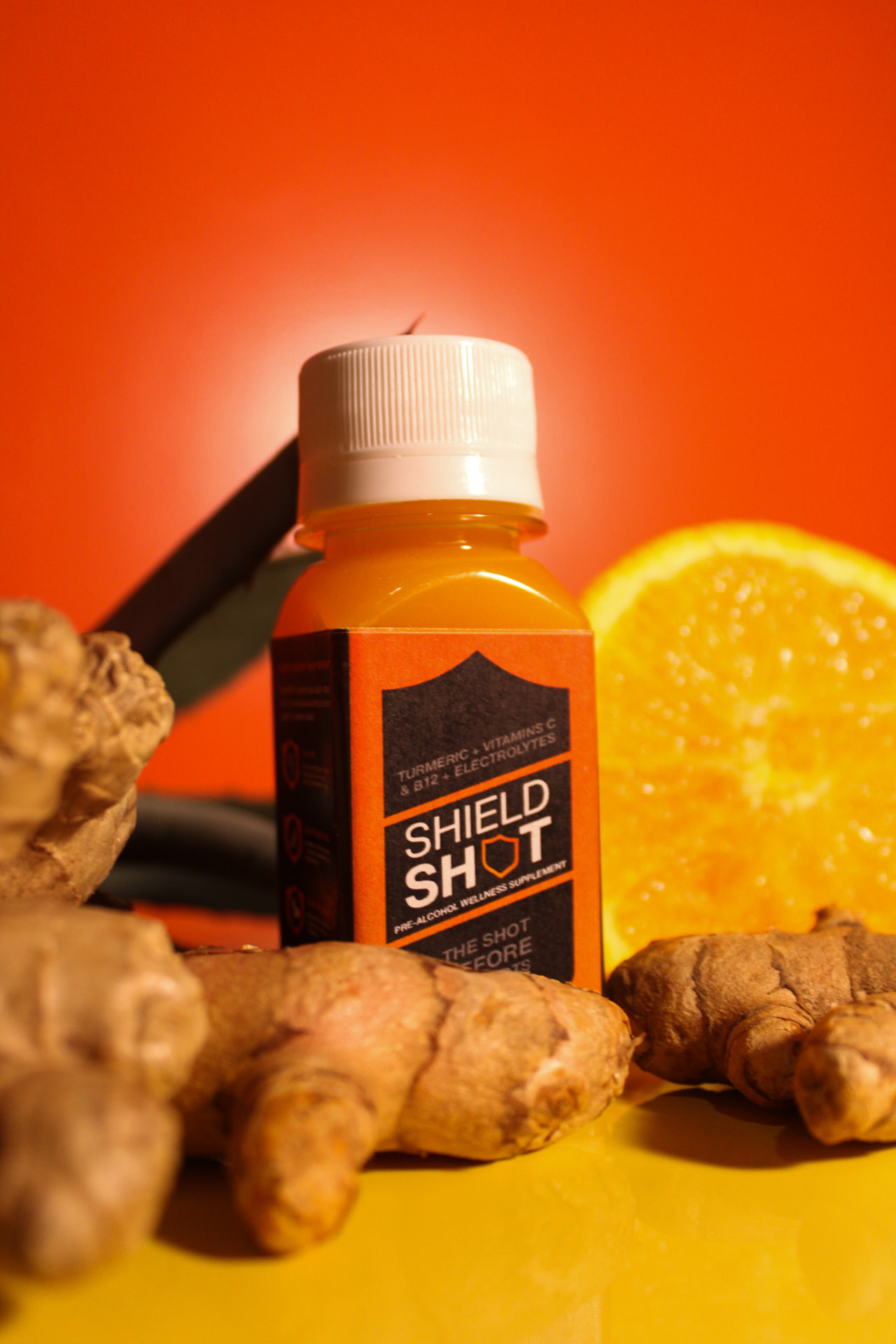
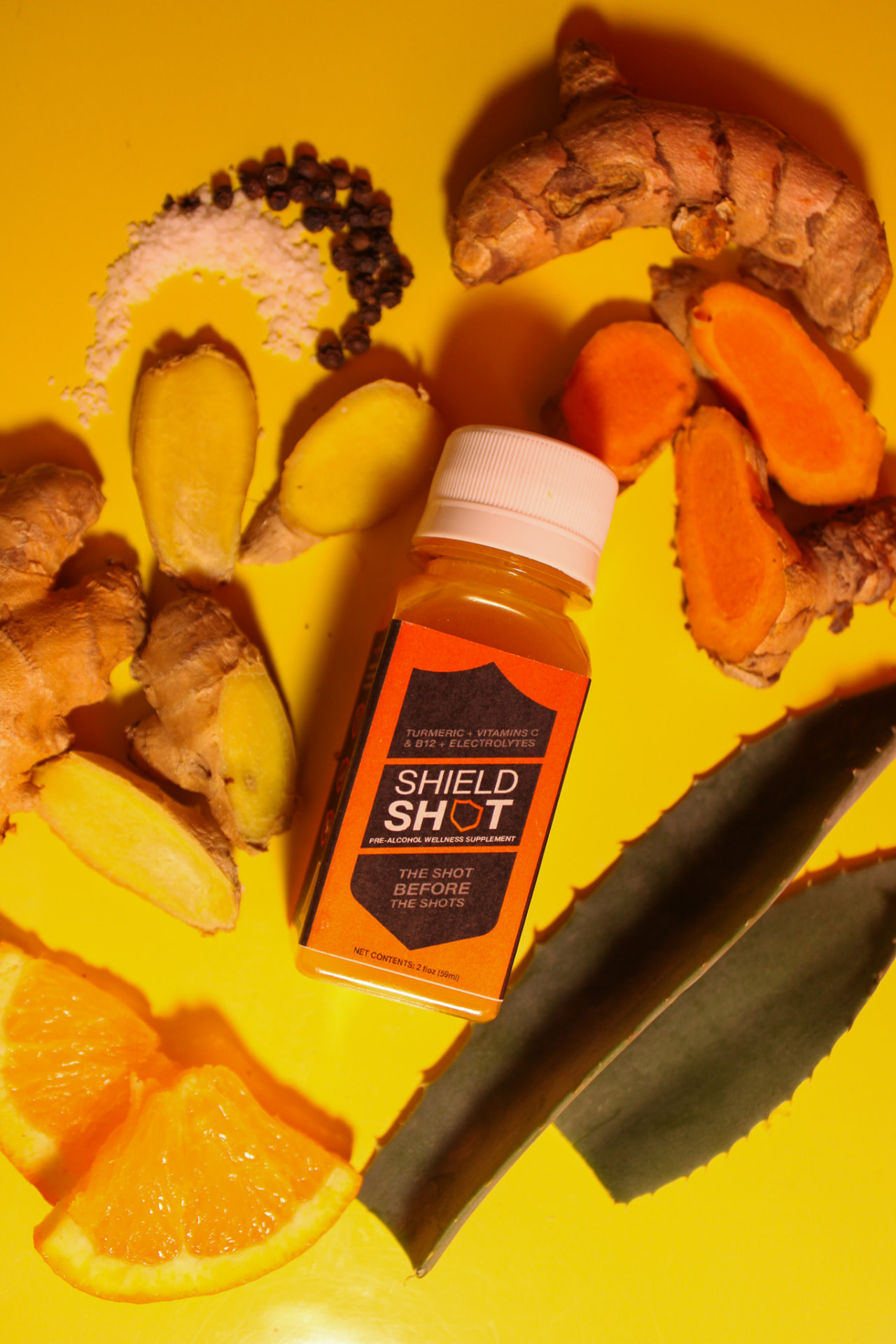
Photos by Chloé N.
ShieldShot ended the semester with packaging copy that's actually been tested against real people, a finished brand identity, and a specific outreach plan across three kinds of retail partners.
3
Retail categories researched for outreach
83%
Understood "next-day clarity" as intended
90%
Said they'd buy ShieldShot in store